GTMaritime’s Updated Dashboard: Enhancing User Experience and Efficiency
At GTMaritime, we’re committed to continuous improvement, ensuring that our users enjoy the best possible experience while managing mission critical maritime communications and cybersecurity. We’re excited to announce the release of our updated dashboard, user interface (UI), a major update designed to enhance both usability and efficiency. This update brings the UI in line with our other products, ensuring a cohesive and familiar experience across the board for all users.
A Cohesive, Familiar Experience Across All Products
We understand that consistency across platforms and products is essential for ease of use, especially in high-stakes maritime environments. That’s why the updated dashboard brings a familiar look and feel, aligned with other GTMaritime products, to improve navigation and reduce the learning curve for users.
This unified approach across our product suite ensures users will experience a smooth transition between different sections, minimizing confusion and allowing you to focus on what matters most.
Streamlined Navigation: Actions Refocused by Section
One of the biggest changes in the new dashboard is the refocused navigation system, designed to make every action easily accessible. We’ve reorganised the interface, grouping all actions into their corresponding sections for faster, more intuitive use.
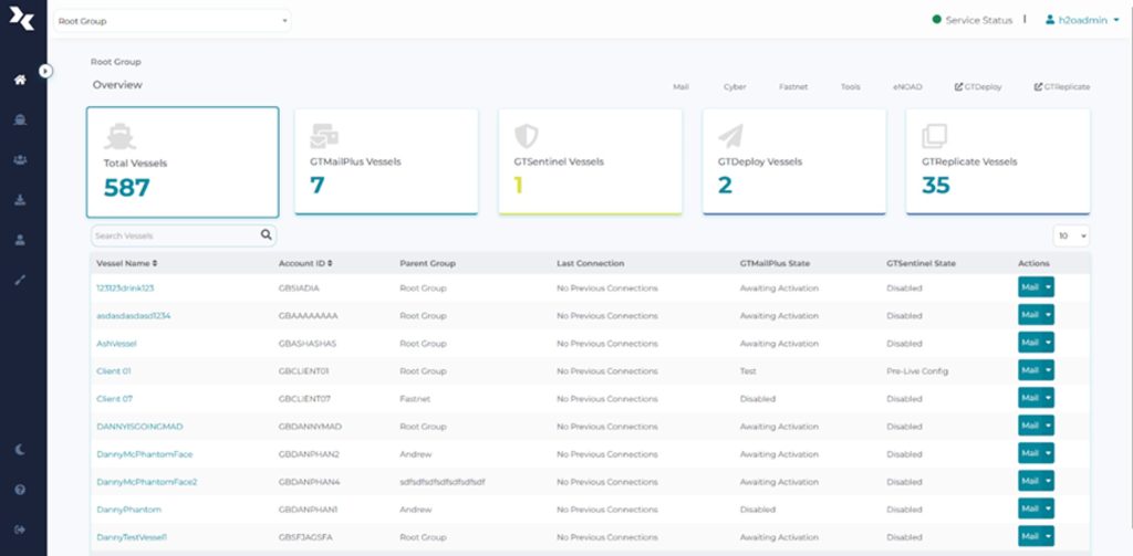
Each vessel or group now has a dedicated dropdown menu. When you click on a vessel or group, you’ll see options specific to what you’re looking for, categorised clearly under headings like Mail, Cyber or Tools. This eliminates the need to search through multiple areas of the system, ensuring you always find what you need with minimal effort.
For example, clicking on “Mail” in the dropdown of any vessel or group will take you directly to the section where all mail-related items are consolidated. This consistent categorisation extends to cybersecurity, tools, and other essential functions, streamlining your workflow and allowing you to manage your fleet with greater speed and precision.
Improved Product Visibility
Managing a fleet is a complex task, especially when each vessel has unique communication and cybersecurity requirements. To make your job easier, we’ve enhanced product visibility across the interface, offering a comprehensive overview of installed products on each vessel from the moment you log in.
The home screen now gives you a bird’s-eye view of the products installed across your fleet. Each vessel’s setup is displayed clearly, with users able to filter through different vessels by using tiles on the home screen. This makes it easy to quickly assess which vessels have which services installed, helping you stay informed and up to date.
Enhanced Vessel-Level Widgets for In-Depth Status Monitoring
Vessel-level widgets are now available throughout the application to give you a clearer picture of each vessel’s status. These widgets provide an at-a-glance view of vital information related to specific services.
Take the mailbox overview widget, for example. This feature allows you to see the current status of remote configuration, when the vessel last connected, as well as all account information for that vessel—all in one place, making it easy to identify and troubleshoot any issues that may arise.
Enhanced Message and Mail Management
One key enhancement of the new dashboard is the visibility of quarantined messages. Previously, quarantined messages were only visible at the group level, which sometimes made it difficult to pinpoint issues at the vessel level. Now, users can see quarantined messages for each individual vessel, complete with counts for each message state—whether quarantined, flagged, or resolved. This granular control allows for greater flexibility when managing your fleet’s email traffic, helping you respond to potential issues faster and with greater precision.
Additionally, the message search feature has been overhauled to offer more robust filtering capabilities. Users can now perform more detailed searches, allowing you to quickly find the messages you’re looking for, regardless of how large your message volume may be. This enhanced search functionality saves time and ensures that you can quickly locate critical communications when needed.
Introducing Dark Mode: A Customizable User Experience
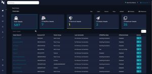
In response to user feedback and to provide greater flexibility, we’re excited to introduce Dark Mode as part of the updated GTMaritime user dashboard. This new feature allows users to switch between light and dark themes based on their personal preferences.
Dark Mode is especially useful in environments with low lighting, such as vessel bridges during nighttime operations, where a darker interface reduces eye strain and improves focus. By giving users the option to toggle between light and dark modes, we’re catering to individual working conditions and preferences, ensuring that the dashboards adapts to the needs of each user.

A Future-Proof Solution for Maritime Communication
GTMaritime’s updated dashboard is designed with the future in mind, providing a scalable solution that can adapt to your needs as your fleet grows and your requirements change.
Our mission at GTMaritime has always been to provide best-in-class solutions for secure, reliable mission critical maritime communication, and this dashboard update is a reflection of our ongoing commitment. We’ve taken user feedback into account, refined our approach, and delivered an interface that is not only visually consistent across products but also significantly more efficient.
Conclusion
The new GTMaritime dashboard is a step forward in delivering a more streamlined, user-friendly experience across all our products. With enhanced navigation, improved product visibility, more detailed status widgets, and better message management, users can now enjoy a more intuitive, efficient workflow. Whether you’re responsible for a small fleet or managing large-scale operations, our updated interface is designed to help you work smarter, not harder.
We’re confident that this update will make a significant difference in your day-to-day operations. Users can explore the new dashboard now by clicking on the link – “Check out the new UI!” which can be found on the current Dashboard.
If you require support with the new dashboard, please contact our team here
